Geographic Variation in Health Care and the Affluence-Poverty Nexus
This article examines the validity of the 30% thesis. It is divided into 6 parts:
Evolution of 30%
Health care is caught in the contradictory realities that spending growth is implicit, but excessive growth cannot be countenanced. Yet the pressures to spend are unrelenting. One source is the availability of new treatments and a second is the large reservoir of unmet need [2]. However, economic growth is the principal driver [3]. Indeed, health care is a major engine of economic growth and a major source of jobs.
Most economists predict a continuing growth of health care spending [4] and, faced with caps on the growth of graduate medical education [5], most workforce experts believe that the nation is headed toward deepening shortages of physicians [6]; but not all agree. Based on their studies of geographic variation, researchers associated with the Dartmouth Atlas have concluded that as much as 30% of health care spending is unnecessary [7–9] and that the nation already has enough physicians [10,11].
The fact that health care use varies so widely among regions is one of the great enigmas of health care. Yet it is not a new phenomenon. Geographic differences have been observed since adequate measuring tools were developed in the 1930s and even before. However, over the past 15 years John Wennberg and his associates at Dartmouth have documented this phenomenon more fully, and have proposed explanations for its causes [7–11]. These investigators have concluded that most geographic variation in health care cannot be explained by patients’ needs or preferences, nor by their illness levels or demographic characteristics. Knowing that practices vary among physicians, they have attributed much of this variation to the overuse of “supply-sensitive” specialty services, a consequence of the perverse incentives of the fee-for-service system. Remedies that have been proposed include fewer specialists and more primary care physicians, less fee-for-service and more managed care, less physician autonomy and more regulation, and more direct involvement of patients in shared medical decisions. This approach carries the promise that, if all areas of the nation could spend at the rate of those that spend the least, 30% could be saved, enough to pay for health care reform. It is a powerful message with appeal to powerful constituencies.
Birth of the atlas
The notion that “more is less” emerged during the 1970s and 1980 when Wennberg [12] observed that the frequency of certain surgical procedures differed in Boston as compared with New Haven and also among small towns in Maine and New Hampshire, a phenomenon that Glover had noted in the use of tonsillectomies in Britain 40 years earlier. However, the Dartmouth team examined this phenomenon systematically, concluding that it was not due to differences among the patients but to differences in the efficiency of physicians’ practices.
As the Clinton Health Plan was evolving in the early 1990s, the Dartmouth team proposed that rather than simply comparing towns, they could create a national atlas of health care. With support from the Robert Wood Johnson Foundation and data from Medicare, they divided the nation into 306 hospital referral regions (HRRs), each a closed system wherein most of the patients received most of their care most of the time [13]. But the towns they had studied, such as Lebanon, New Hampshire (population 12,000) and Portland, Maine (population 64,000), were much smaller and homogeneous than their HRRs, which ranged in population from 200,000 to more than 5 million. Some were confined to a major urban center and some spanned the breadth of a rural state. Wide differences existed in income, race, and ethnicity, both within and between them. The patch-quilt map that resulted proved to have no epidemiologic integrity [14].
Methodological pitfalls
Unexplained variation
The most accurate measures were of input prices and special payments, which can be obtained from Medicare data and other government reports. However, Medicare data do not provide similar precision in measuring illness levels. Almost 20 years ago Fisher, the Dartmouth group’s current leader, showed how inaccuracies in Medicare’s condition-specific coding and its application by hospitals can lead to substantial error in assessing risk [15]. Although efforts have been made to improve its value in risk adjustment, Medicare administrative data remain a limited source.
Adjusting for race and poverty
Demographic adjustments employed in the Dartmouth Atlas present even greater challenges. Whereas age and gender adjustments are generally valid, the race adjustment, which simply distinguishes black versus nonblack, is not. Based on their statistical approach, Dartmouth researchers have concluded that “race has virtually no impact on use” [16,17], despite a vast literature on race and health care that shows the opposite [18]. Indeed, the author and his colleagues have found that rates of health care use among poor African Americans in major urban centers are more than double those of affluent whites.
The problem in adjusting for income is even greater. As others have done, Dartmouth researchers based the income of enrollees on the average income of the ZIP codes in which they resided. This measure proves to be a reliable for working-age adults, whose incomes tend to reflect their current wealth and both their past and present socioeconomic circumstances, and whose place of residence reflects their income. However, none of this is true for seniors. Income among retirees is not a valid proxy for either wealth or past economic circumstances. Moreover, housing for low-income seniors is often located outside low-income neighborhoods. As a result, income among seniors captures less than half of the poverty effect that is revealed by ZIP-code income among working-age adults, making it almost impossible to risk-adjust Medicare data. Possibly because of this, Dartmouth researchers have also concluded that “poverty and income explain almost none of the variation” [16,17], which is surprising since the effect of income on health is pervasive [19]. In Dartmouth’s formulation, the resulting gap simply adds to the “unexplained” residual, which is attributed to practice variation. While there are many methodological pitfalls in the Dartmouth Atlas, the failure to properly adjust for income is the most profound.
Medicare as the source of data
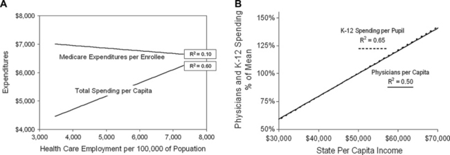
A second deficiency of the Dartmouth Atlas is its dependence on Medicare data as the measure of use and expenditures. Because the Atlas is called the Dartmouth Atlas of Health Care, most assume that it applies to health care generally. But for that to be true, Medicare data would have to explain not only the care of Medicare patients but also of non-Medicare patients. Indeed, Dartmouth researchers insist that they do [20], but the data show the contrary [21,22]. Medicare expenditures per enrollee bear no resemblance to overall health care spending per capita, nor should they (Figs. 1 and 2). The resources that are brought to bear on the care of any individual patient do not flow simply from that patient’s payment sources but from the aggregate of all revenues. Regions differ not only in Medicare revenues but in the revenues they receive from employer-sponsored insurance, Medicaid, and on behalf of the uninsured. It is the aggregate revenues from all sources that determines the personnel and other resources available for care [21]. As Fig. 1A displays, the numbers of health care workers per capita in the various states correlates closely with the total health care expenditures per capita, but they bear no relationship to the levels of Medicare expenditures per enrollee, and quality follows total spending [21].
Medicare doing better versus medicare catching up
One reason for the seemingly anomalous geographic distribution of Medicare spending is that there are several different categories of Medicare beneficiaries. For many beneficiaries, Medicare coverage continues the access to care that they previously enjoyed as employees, and for them the relationship between Medicare spending and quality is simple and unambiguous: more is more. More benefits and more access to benefits yields better outcomes, not in every circumstance, but on average. The second group of beneficiaries consists of younger adults who are disabled. These individuals also attain better proximate outcomes from more Medicare spending, but as a group they are on a path toward diminishing health and display poorer long-term outcomes. This leads to the third group: individuals who, unlike the first, were previously uninsured, but like the second, have poorer overall health status, use more resources on entering Medicare and remain sicker, despite their high use, because it is not easy to repair a lifetime of poor health [23,24]. The latter 2 groups are located disproportionately in poor areas in the south, where overall health care spending is low, and in pockets of poverty in the urban north, where overall spending is high. The metric of Medicare sees these dissimilar areas as having the same high Medicare spending and the Dartmouth Atlas displays them that way (Fig. 2A). But they are a peculiar mélange that obfuscates the real dynamics of health care.
Employing death as the outcome
The final methodological pitfall is the need to relate use and expenditures to outcomes. While Medicare administrative data provide information on certain process-of-care outcomes, they do not provide measures of clinical outcomes. To circumvent this deficiency, Dartmouth researchers declared that death was the outcome. Their Web site explains, “we focused only on patients who died so we could be sure that all patients were similarly ill. By definition, the prognosis was identical—all were dead. Therefore, variations cannot be explained by differences in the severity of patient’s illnesses” [13]. Accordingly, they limited their studies to patients during last 6 or 24 months of life. Of course, similarly dead is not similarly ill, a point made more forcefully by others [25–27]. Vast differences exist in the complexities of illness and in its costs among patients who eventually die. Moreover, little of that care is administered with the expectation that death will be the outcome. Nonetheless, it is the notions of “dying” as the risk factor and “being dead” as the outcome that led the Dartmouth group to conclude that wasteful regions [7] and inefficient hospitals [28] cause 30% more spending than is necessary.
Alternative estimates = “more is more”
Several investigators have developed alternative models to explore the relationship between resource use and outcomes. Bach [27] refined the Dartmouth approach in a comparison of hospitals nationally by adjusting for risk, using the All Patient Refined Diagnostic-Related Groups (APR-DRG) system, which is based on 30 comorbidities that can be extracted from Medicare administrative data. He then compared the intensity of care in hospitals, as listed in Dartmouth Atlas, with each hospital’s APR-DRG-adjusted severity of illness among decadents, and found that hospitals where patients consumed more resources (by Dartmouth’s measure) had sicker patients (measured by the APR-DRG scale). Although this did not answer questions about outcomes, since the outcome observed still was death, it did explain why some hospitals used more resources for patients during their last 2 years of life. Their patients had more comorbidities and were sicker.
Silber and colleagues [29] took another approach. Instead of comparing resource use among patients during their last 6 months or 2 years of life, they looked prospectively at surgical outcomes. The outcomes they examined were mortality at 30-days and mortality following a postoperative complication. Like Bach, they applied detailed risk adjustments and gauged risk-adjusted mortality against the intensity of care among hospitals nationally, as listed in the Dartmouth Atlas. It was found that “more aggressive” hospitals had decreased postoperative mortality and that their mortality following postoperative complications was decreased even more. In other words, when the outcomes of care were examined in temporal proximity to the care, the hospitals with a higher intensity of care (by Dartmouth’s measure) had lower postoperative mortality and lower mortality after postsurgical complications.
A study conducted by Barnato and colleagues [30] was also prospective. This group examined mortality among patients who had a high predicted probability of dying (PPD) in Pennsylvania hospitals. They used the PPD scale to risk-adjust their patients and, rather than using hospital intensity measures from the Dartmouth Atlas, they constructed their own, based on days in the intensive care unit and various critical care interventions. Their key observation was that 1 year risk-adjusted mortality in patients with a high PPD was lower in hospitals with higher treatment intensities, about 12% lower.
Ong and colleagues [26] drew a similar conclusion from a prospective study of patients with heart failure at 6 California teaching hospitals. These investigators used a risk-adjustment methodology similar to that used by Bach and Silber, but added 2 sociodemographic measures: race and Medicaid insurance status. Like Barnato, they used their own measure of intensity, based on the number of hospital days and associated costs during the first 180 days after the index admission, but costs were related specifically to the patients studied and not to some broader measure of intensity within the hospitals. Ong and colleagues also found a very close correlation between greater resource use and lower mortality.
Schreyögg and Stargardt [31] enlarged on this approach in a study of acute myocardial infarction (AMI) among more than 35,000 patients at 115 Veterans Administration hospitals. As in Ong’s study [26], rather than measuring the hospitals’ “intensity,” they measured the costs of care for the cohort of patients with AMI treated at each hospital, adjusted for a broad set of risks, and they compared the average costs in each hospital with the cohort’s average outcomes. They found that for every 10% increase in spending above the mean, mortality at 1 year was decreased by 5% and the hazard ratio for readmission was decreased by 10%.
An identical conclusion was reached by Doyle [32] using a very different experimental approach. Doyle reasoned that, despite extensive risk adjustment, studies like those cited above could have been influenced by unmeasured sociodemographic variables. For example, Barnato’s high-intensity hospitals had more socially disadvantaged patients, which very likely biased the results toward smaller differences in mortality than actually existed. To circumvent this potential problem, Doyle examined the outcomes of care for cardiac emergencies among visitors to Florida, whose incomes and health status were presumably random and not related to the socioeconomic circumstances that characterized the hospitals where they received care. He related their mortality to the spending level for end-of-life care that was customary at all hospitals in the county where the cardiac care was administered. Like the aforementioned study, Doyle found that for every 10% increase in the hospital’s general level of spending, there was a 5% reduction in the probability of patients dying from their cardiac emergency.
Quintiles model
Recognizing that death cannot be the only outcome, the Dartmouth team constructed an arcane system of analysis that not only has failed to provide a better measure but has served as an obstacle to rational discussion. It was initially published by Fisher and colleagues [8,9] in two articles in Annals of Internal Medicine in 2003, which have since been the centerpiece of the Dartmouth mantra. The experimental design employed, which is briefly described below, was extremely convoluted. It began by collapsing Dartmouth’s 306 HRRs into 5 geographically dispersed “quintiles,” based on the average levels of Medicare spending in each; this served merely to define the 5 quintiles. To assess outcomes, smaller cohorts of patients from previous national studies of hip fracture, AMI, and colon cancer were assigned to these quintiles, based on their places of residence, and resource use was assumed to be at the average level of the entire quintile. The outcomes compared included access to care, satisfaction, functional status, mortality, and various processes-of-care measures, which proved to more accurately assess community inputs than the medical care that was received.
Random exposure to medicare
A critical assumption in Fisher’s model was that cohort members differed in their Medicare spending but were otherwise random with respect to all other characteristics. This was patterned after a study of long-term mortality in men who were draft-eligible during the Vietnam War but who may or may not have been “exposed” to Vietnam. In Fisher’s study, the approximately 50,000 cohort members in each quintile were assumed to have been “exposed” to the average Medicare spending of the 6 million other Medicare enrollees in their respective quintiles. However, even if this were a valid model, the spending of interest is not Medicare spending but total health care spending, which is the exposure that would most have influenced outcomes such as those measured [21].
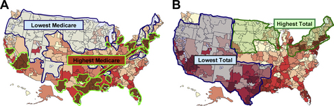
But the quintiles model was not valid. While the Vietnam draft did not select for any particular characteristics, residence in the various quintiles did. For example, the highest-spending quintile was composed of the peculiar combination of HRRs in the northeast and industrial Midwest, where total spending was high, and in the Deep South and southern California, where total spending was low (see Fig. 2). It included dense urban centers, such as New York, Newark, Philadelphia, Chicago, Detroit, Pittsburgh, Los Angeles, New Orleans, and Florida’s major cities, but also smaller wealthy communities such as Palm Springs, but accounted for only a few percent of the total land mass of the United States. By contrast, the lowest spending quintile covered almost half the nation, from Washington and Oregon across to northern New England. Moreover, while the Dartmouth group asserts that the data were “adjusted,” the actual adjustments for known sources of variation in health care were very limited. Age was adjusted according to decade; income according to social security payments (high, middle, and low); and comorbidities on a scale of 0, 1, or more, gradations that cannot capture the vast sociodemographic differences and variations in health status.
Failure to discern differences
It is not surprising, therefore, that the principal conclusion from the quintiles study (as framed by the Annals editors) was that “Medicare beneficiaries who live in higher Medicare spending regions do not necessarily get better-quality care,” nor do they “necessarily have better access to care or health outcomes” [8,9]. Nor, in fact, did they experience anything that was worse. Measures such as 1-year and 5-year mortality, functional status, access to care, satisfaction with care, and various process measures were the same, or nearly so, in each. Nothing was “necessarily” better, and adjusting did not make anything necessarily worse. As in Lake Wobegon, everything was above average and nothing was different.
The investigators echoed the editor’s modest interpretation in most of their article. However, they fueled subsequent misinterpretation and exaggeration by a statement in the appendix that “residence in higher-spending regions may cause worse survival,” although the “worse survival” was marginal and inconstant among the 3 disease cohorts and 2 analytical approaches employed. Similarly, they translated the fact that 3.1% of patients in the highest-spending quintile versus 2.5% in the lowest had problems accessing physicians into “HRRs with a higher expenditure index provided significantly worse access to care” [8].
Crafting the Dartmouth message
In 2002, Wennberg and colleagues [7] summarized their previous studies of HRRs in a seminal article in Health Affairs. They concluded:
The “quintiles” study, published 1 year later [8,9], reiterated this message:
Propelling 30% into president Obama’s office
Within months of the “quintiles” publication, MedPAC (the committee that advises Congress on Medicare and Medicaid policy) brought Dartmouth’s 30% solution to the attention of Congress [33]. However, it was not until 2 years later that Paul Krugman brought it to the public. Writing in The New York Review of Books, he said “suppose, for example, that we believe that 30 percent of US health care spending is wasted, and always has been” [34]. The next year, Shannon Brownlee, who was a senior fellow at the New America Foundation but later became a collaborating member of the Dartmouth group, presented the Dartmouth group’s message a book, Overtreated [35], parts of which she reiterated in The Atlantic [36]. At the same time, the New York Times editorialized, “If the entire nation could bring its costs down to match the lower-spending regions, the country could cut perhaps 20 to 30 percent off its health care bill” [37], and its business columnist, David Leonhardt, chose Overtreated as the 2007 economics book of the year [38]. The 30% solution had become firmly embedded in the popular culture.
Earlier in 2007, Senator Barack Obama had announced his candidacy for the Presidency. Speaking in Dallas 1 month later, Peter Orszag, then Director of the Congressional Budget Office (CBO), cited Dartmouth’s conclusions in reporting, “there are huge variations in health care costs across different regions of the country that can’t be explained other than because of the intensity of care. … We need to change the incentives so we get better care, not more care.” Other economists who were advising the Obama campaign concurred, citing “over $600 billion of potential savings annually” [39]. Writing in the New England Journal of Medicine later that year, Orszag laid out what was to become the fabric of health care reform [40]:
In early 2008, this perspective was repeated in the New England Journal of Medicine by Thomas Boat and Paul O’Neill, chairs of an Institute of Medicine committee [41], and by Glen Hackbarth and Robert Reischauer [42], chair and vice-chair of MedPAC, who emphasized that “the incentives inherent in the dominant fee-for-service payment system are the root cause of these problems.”
By the time of the 2008 Presidential election, Senator Tom Daschle, who subsequently was President Obama’s choice for Secretary of Health and Human Services, had published a book in which he said “up to 30% of the care we receive today is unnecessary” [43], and Senator Max Baucus, Chairman of the Senate Finance Committee, said, “according to the CBO (headed by Orszag), up to one-third of health care spending—more than $700 billion—does not improve Americans’ health outcomes.” With a growing consensus that savings were readily at hand, Senator Obama promised voters that, if elected, he would lower the country’s health care costs enough to “bring down premiums by $2500 for the typical family” [44].
When the new administration began in 2009, Orszag was Director of the Office of Management and Budget (OMB). In an article in The New Yorker [45], Ryan Lizza noted that “as a fellow at the Brookings Institution, Orszag became obsessed with the findings of a research team at Dartmouth.” He quoted Orszag as saying, “there must be enormous savings that a smart government, by determining precisely which medical procedures are worth financing and which are not, could wring out of the system.” As health care reform heated up, Orszag added, “if we can move our nation toward the practices of lower-cost areas, healthcare costs could be reduced by 30%, about $700 billion a year” [46], which was the amount then believed to be necessary to pay for health care reform. His conclusions were endorsed by the Council of Economic Advisors (CEA), the Government Accountability Office (GAO) and 23 of the Nation’s leading economists, including 2 Nobel laureates, who in an open letter to the President, said that the problem was one of “distorted incentives that pay for volume rather than quality” [47].
To promote health care reform legislation, President Obama visited Green Bay, Wisconsin during the summer of 2009, where he said “there are a lot of the places where we spend less on health care, but actually have higher quality than places where we spend more.” In Grand Junction, Colorado, which the Dartmouth group had singled out as a low-cost region [4], he said, “you know that lowering costs is possible if you put in place smarter incentives.” This theme culminated in his statement to a Joint Session of Congress that “we’ve estimated that most of this plan can be paid for by finding savings within the existing health care system, a system that is currently full of waste and abuse.” Commenting earlier in The New Yorker, Lizza had observed, “Obama is in effect betting his Presidency on Orszag’s thesis [44].
The compelling imperative
How did this occur? One possible answer is found in the musings of the noted economist, Robert Evans, who referred to conclusions such as the 30% solution as “Zombies—ideas that are neat, plausible and wrong and dangerously misleading for health care policy,” noting further that “their resilience depends crucially on the extent to which they resonate in the popular imagination” [48]. The notion that specialists are the cause of excess health care spending and that 30% could readily be saved appears to have resonated with a broad range of constituencies in medicine, economics, politics, public policy, and the press who have seen the Dartmouth Atlas as providing easy answers to the complex question of escalating health care spending and as offering an avenue toward finding ways to control a specialist-dominated health care system.
A second answer is found in the success of Health Dialog, “the commercial partner to Wennberg’s research” [49]. The company markets Shared Decision-Making as a tool for decreasing variation and reducing costs. In 2002, a few years after Health Dialog formed, Wennberg and colleagues [7] proposed shared decision making as the basis for Medicare reform. Two years later, Health Affairs devoted an entire issue to geographic variation and shared decision making, in which Wennberg further promoted its use [50]. And as health care reform discussions began in 2008, Wennberg and colleagues [51] issued a White Paper for Congress and the Obama Administration, in which they urged the Centers for Medicare and Medicaid Services (CMS) to “reimburse providers for the costs of shared decision-making” and “require that hospitals and surgery centers support shared decision-making as a condition for participation in the Medicare program.” Shortly thereafter, the Affordable Care Act was signed into law. Section 3506, entitled “Program to Facilitate Shared Decisionmaking,” mandates that contracts be awarded to “develop and identify standards for patient decision aids.” Six months later, MedPAC called for regulations that would mandate shared decision making as part of Medicare payment policy [52], and on the anniversary of the Affordable Care Act, CMS issued its proposed guidelines for Accountable Care Organizations (ACOs) that called for the use of shared decision making methods. In proudly chronicling many of these political success, Spencer Trask, the investment firm that helped to launch Health Dialog, noted that “investors saw a 15 fold return” and concluded: “it pays to recognize a good idea” [49].
Even beyond such political and commercial interests, the Dartmouth message has resonated among a broader audience that sees no alternative explanation for the growth of health care and its seemingly anomalous geographic distribution. The next section attempts to fill that void. It describes the affluence-poverty nexus, a conceptual framework based on the reality that variation in health care use and outcomes is not a matter of waste and inefficiency, but rather a manifestation of the nation’s social and economic fabric. This framework provides a context in which to plan a more equitable and affordable health care system [1].
The affluence-poverty nexus
As is apparent from the foregoing, studies of geographic variation have enormous potential for providing insights, but they can also create misunderstandings. One reason is that the geographic units studied vary in size and character and, therefore, offers different windows into health care. For example, large regions, such as states, reveal something about aggregate communal behavior but little about individuals. At the other extreme, ZIP codes and census tracks, which tend to cluster people with similar characteristics, reveal a good deal about individual behavior but tell little about communal dynamics. Moreover, the vectors relating income and health care use at these two levels are very different. The regional vector is linear and direct: wealthier regions use more aggregate health care and have better average outcomes (see Fig. 1B). Conversely, the individual vector is nonlinear and inverse: low-income patients use the most health care but tend to have the poorest outcomes (Fig. 3). These two countervailing vectors come together to form the affluence-poverty nexus (Fig. 4).
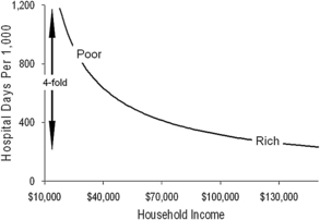
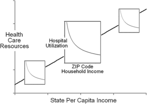
Fig. 4 The affluence-poverty nexus. The relationship between state health care spending and health resources from Fig. 1 is overlaid with the relationship between household income and hospital from Fig. 3. This figure illustrates how increases in health care at lower incomes intersect with the health care resources that are available within communities.
The communal level
Among states, there are strong relationships between per capita income, health care spending, the size of the health care labor force, and the number of physicians per capita (see Fig. 1B) [21,53]. More clinical resources in states with more spending correlate with better access to care, better quality of care, and better attainment of process-of-care benchmarks. However, because Medicare expenditures per enrollee are high in many southern states, where total spending is low, the relationship between Medicare spending and outcomes is reversed, leading to the Dartmouth group’s anomalous conclusion that more spending yields poorer outcomes [8,9,11], whereas the opposite is actually true [21,53,54].
Wealthier states not only spend more on health care; they display other measures of economic advantage, such as lower poverty rates, fewer uninsured individuals, lower rates of prison incarceration, and larger investments in public services [21]. The close relationship between health care and social spending is emphasized by the strong correlation between per-pupil expenditures for K-12 education and the number of physicians per capita, and the correlation of both with the per capita income of states (see Fig. 1B). Thus, a complex series of relationships bind communal wealth to health care services and bind these to education and social services. As a result, it is difficult to establish causality between spending and broad health care outcomes, such as access, quality, and mortality. However, the web of interrelationships is unambiguous, and it has been durable over time. It indicates that regional variation in health care resources will exist as long as regional variation in economic status persists.
The individual level
Just as communal wealth is an important factor in aggregate health care resources and outcomes, personal income and its associated manifestations determine a great deal about how these resources are used by individuals within each region [18,55]. Among individuals, the author and his colleagues have observed a steep, inverse relationship between income and hospital use when studied at the ZIP-code level (see Fig. 3). Much of the increase in use at low incomes is due to high rates of hospital readmission, as much as sixfold for certain conditions.
This steep relationship between income and hospital use is strongest among working-age adults, for whom household income is a good proxy for personal wealth and whose place of residence reflects past economic circumstances, as discussed earlier. A similar relationship between income and health care spending can be found in data from the Medical Expenditure Panel Survey [56], and it is reminiscent of the classic relationship found between income and mortality [57]. These findings are consistent with a host of other studies that have found increases in health care use of 50% to 100% in the lowest-income groups as compared with highest in both the United States and other developed countries [58–62].
Patients in the Medicare age group display weaker relationships between income and health care use, reflecting the weaker explanatory power of income among seniors, and this adds to the margin of “unexplained” variation reported by the Dartmouth group and others [17,63,64]. Indeed, the weakness of income as a proxy for poverty among seniors is a major impediment to interpreting health care use and outcomes in the Medicare age group.
The intersection of poverty and urbanization
While income is the measure, poverty is the agent of excess health care use, particularly in the urban environment, where it becomes concentrated by the forces of residential segregation [65]. It is not surprising, therefore, that total health care spending is highest in affluent urban centers with dense poverty ghettos, such as New York, Philadelphia, Chicago, and Los Angeles, and lowest in smaller communities where poverty is both less frequent and less dense, such as Rochester, Minnesota (home to the Mayo Clinic) and Lebanon, New Hampshire (home to the Dartmouth-Hitchcock Medical Center). This distinction between large and small communities emerges in the Dartmouth group’s studies of Academic Medical Centers, where higher use in America’s largest cities is interpreted as “inefficiency,” and the lower use in small towns, many home to colleges, is seen as “efficient” [10]. Yet when the care at Academic Medical Centers with differing levels of “efficiency” is adjusted for risk and income, the levels of utilization are very similar in all [26].
Summary
Almost 50 years ago, John F. Kennedy told Yale’s graduating class that “what is needed today is a new, difficult but essential confrontation with reality, for the great enemy of truth is very often not the lie—deliberate, contrived and dishonest—but the myth—persistent, persuasive and unrealistic.” Today’s myth is the belief that 30% of health care spending is due to supplier-induced demand and that this amount could be saved if high-spending regions could more closely resemble low-spending regions. The reality is that, while quality and efficiency remain important goals, the major factors driving geographic differences are related to income inequality. Yet, following the road map of the Dartmouth Atlas, the Affordable Care Act includes penalties for hospitals with excess preventable readmissions (which are mainly of the poor), incentive payments for providers in counties that have the lowest Medicare expenditures (where there tends to be less poverty), incentives for physicians and hospitals that attain new “efficiency standards” (ie, costs similar to the lowest), and a call for the Institute of Medicine to recommend additional incentive strategies based on geographic variation. This scenario is coupled with a growing bureaucracy, following the blueprint laid out by Brennan and Berwick in the 1990s [66], but with no tangible measures to increase physician supply.
Meaningful health care reform means accepting the reality that poverty and its cultural extensions are the major cause of geographic variation in health care utilization and a major source of escalating health care spending. And it means acknowledging Bertrand Russell’s admonition that a high degree of income inequality is not compatible with political democracy [67], nor is it compatible with health care that this nation can afford. As solutions are sought both within and outside of the health care system, misunderstandings of how and why health care varies geographically cannot be allowed to deter these efforts, and the pervasive impact of poverty cannot be ignored [68].
References
[1] R.A. Cooper. Regional variation and the affluence-poverty nexus. JAMA. 2009;302:1113-1114.
[13] Wennberg JE, Fisher EA, Goodman DG, et al. The Dartmouth atlas of health care 2008. Lebanon (NH), The Dartmouth Institute for Health Policy and Clinical Practice Center for Health Policy Research Available at: http://www.dartmouthatlas.org/. Accessed April 15, 2011.
[14] R.A. Cooper. Wrong map for health reform. Washington Post, September 11, 2009. p. A27. Available at: http://www.washingtonpost.com/wp-dyn/content/article/2009/09/10/AR2009091003405.html Accessed April 15, 2011
[16] J. Wennberg, S. Brownlee. The battle over rewarding efficient providers. Available at: http://healthaffairs.org/blog/2009/11/17/the-battle-over-rewarding-efficient-providers Accessed April 15, 2011
[34] P. Krugman. The conscience of a liberal. New York: WW Norton; 2007.
[36] S. Brownlee. Overdose: the health-care crisis no candidate is addressing? Too many doctors. The Atlantic. December, 2007. Available at: http://www.theatlantic.com/magazine/archive/2007/12/overdose/6452/ Accessed April 15, 2011
[37] The high cost of health care. New York Times, November 25, 2007. Available at: http://www.nytimes.com/2007/11/25/opinion/25sun1.html Accessed April 15, 2011, [editorial]
[38] D. Leonhardt. No. 1 book, and it offers solutions. New York Times, December 19, 2007. Available at: http://www.nytimes.com/2007/12/19/business/19leonhardt.html Accessed April 15, 2011, Economic Scene.
[39] D. Blumenthall, D. Cutler, J. Liebman. Obama health care plan. May 29, 2007. Available at: http://www.nytimes.com/packages/pdf/politics/finalcostsmemo.pdf Accessed April 15, 2011
[41] T.F. Boat, S.M. Chao, P.H. O’Neill. From waste to value in health care. JAMA. 2008;299:568-571.
[43] T. Daschel. What we can do about the health care crisis. New York: St Martin’s Press; 2008.
[44] K. Phillips. Obama’s health care plan. The Caucus: The Political and Government Blog of the Times. May 29, 2011. Available at: http://thecaucus.blogs.nytimes.com/2007/05/29/obamas-health-plan/ Accessed April 15, 2011
[45] R. Lizza. Money talks: can Peter Orszag keep the President’s political goals economically viable? The New Yorker. May 4, 2009. Available at: www.newyorker.com/reporting/2009/05/04/090504fa_fact_lizza Accessed April 15, 2011
[46] P.R. Orszag. Health costs are the real deficit threat. That’s why President Obama is making health-care reform a priority. Wall St J. May 15, 2009. Available at: online.wsj.com/../SB124234365947221489.html Accessed April 15, 2011
[47] C. Rampell. Economic letter to Obama on health care reform. Available at: http://economix.blogs.nytimes.com/2009/11/17/economists-letter-to-obama-on-health-care-reform/ Accessed April 15, 2011
[49] Spencer Trask. Health dialog: the road to health care reform. Available at: http://www.slideshare.net/SpencerTrask/health-dialog-the-road-to-health-care-reform?from=ss_embed Accessed April 15, 2011
[62] M. Marmot. Fair society, healthy lives—the Marmot report. Strategic review of health inequalities in England post-2010. Available at: www.marmotreview.org Accessed April 15, 2011