

Healthcare websites carry a heavier load than most business websites, which is why teams often compare top-rated web design services before they even talk about fonts.
A healthcare website has to calm people down and avoid making a stressful moment even harder. Someone may be checking symptoms at midnight or comparing treatment options after a diagnosis they did not expect.
That means a healthcare website needs to feel useful when the visitor is tired, worried, distracted, or unsure what to do next. Here’s how.
Clear Navigation That Matches How Patients Think
Healthcare organizations often structure websites around internal service lines or administrative categories. That may make sense to the team running the site, but it rarely matches the way patients search.
The main menu should make the most common tasks obvious:
- Find a doctor
- Book or request an appointment
- View services and conditions treated
- Access patient portal information
- Find locations and hours
- Review insurance and billing information
- Get urgent care or emergency guidance
Every major page should answer three quiet questions: Am I in the right place? Can this organization help me? What do I do next?
Trust Signals That Do Real Work
Patients notice when pages feel vague or when a treatment page sounds more like marketing than medicine.
Provider profiles should include medical qualifications, specialties, board certifications where relevant, hospital affiliations, accepted insurance details, languages spoken, and practical appointment information.
Treatment pages should explain who the service is for, what the patient can expect, what the limits are, and when they may need a different kind of care.
More than half of U.S. adults use the internet to look for health or medical information. Often, patients are simply trying to understand whether a symptom or provider is worth their next call, but it does go to show that people are using the web for medical decisions.
Plain Language Without Talking Down to People
A user-friendly healthcare website should use plain language first, then add medical terms where they help. For example, a page can say “heartburn and acid reflux” before introducing “gastroesophageal reflux disease.” A neurology page can explain “numbness, weakness, headaches, or balance problems” before listing diagnostic categories.
Plain language is a safety feature. Patients need to understand when to seek care and what information they should prepare before an appointment.
This is especially important for pages related to urgent care, emergency medicine, post-operative instructions, medication guidance, or follow-up care. In those areas, unclear wording can create hesitation at exactly the wrong moment.
Fast Access to High-Intent Actions
The most important actions should be visible without digging, which often means persistent or repeated calls to action, such as:
- Call now
- Request an appointment
- Find a location
- Log in to the patient portal
- Pay a bill
- Get directions
- View emergency instructions
A fertility clinic, dermatology practice, hospital network, and outpatient surgery center will each have different priority actions, but the point is to make the next step obvious in context.
Privacy, Security, and the Feeling of Safety
Patients share sensitive information with healthcare organizations, so even before they log into a portal or fill out a form, the site should be careful with that trust.
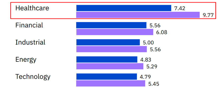
Security and privacy are not only technical concerns, although the technical side matters greatly. In 2025, IBM reported that the average cost of a healthcare data breach was $7.42 million, the highest average among industries for the 14th consecutive year.
That number is a business risk, but for patients, the concern is more personal: Who can see my information, and how is it being protected?
Healthcare websites should clearly explain what happens when a patient submits a form. Also, a site that asks for personal health details through a flimsy-looking form sends the wrong message. Patients may not know the technical details, but they can sense when a digital experience feels careless.
Search That Understands Real Patient Questions
Large healthcare websites need a strong internal search. Not everyone will use the menu, and not everyone will know the correct name for a condition or department.
Search should handle common terms, misspellings, synonyms, doctor names, symptoms, and location names, and results should be filtered in a way that makes sense: doctors, locations, services, articles, and patient resources.
Without that structure, users end up sifting through a pile of technically related but practically unhelpful results.
The Website Is Part of the Care Experience
A healthcare website shapes the first impression, sets expectations, reduces confusion, and can either build or weaken trust before a patient ever speaks to a clinician.
The best healthcare websites are easy to move through, honest about what they offer, accessible to more people, and specific enough to be genuinely useful. They treat patients like people trying to make a good decision under imperfect circumstances.