

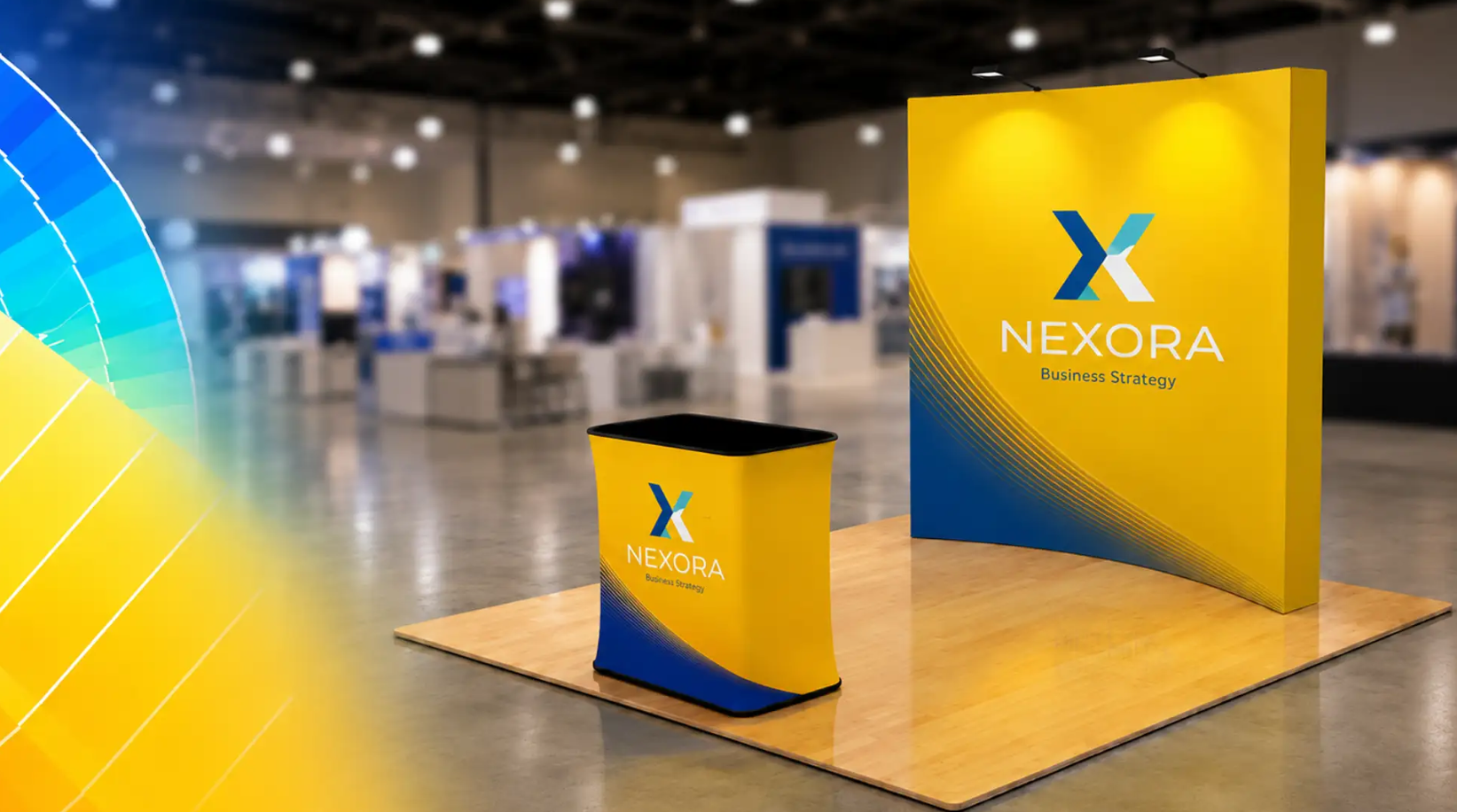
Color is the first decision your booth makes on your behalf and it makes it before a single visitor reads your signage, hears your pitch, or picks up a product.
In the 3 to 5 seconds an attendee takes to scan a trade show aisle, color does more perceptual work than typography, layout, or even lighting. It is processed by the brain faster than shape or text, which means your palette isn’t a design preference. It’s a functional tool with measurable influence on foot traffic, dwell time, and brand recall.
Here’s how to use it deliberately.
Color Drives Behavior Before It Drives Branding
Most exhibitors choose booth colors to match a logo or a style guide. That’s necessary, but it’s only half the job. The other half is understanding what each color asks a passing attendee to do.
Blue builds trust before a word is spoken
It’s the most widely used color in B2B and financial exhibits for a reason, it reads as stable, credible, and low-risk. If your product requires a considered decision (software, financial services, industrial equipment), blue lowers the psychological barrier to a first conversation.
Red creates urgency and physiological arousal
It raises heart rate and narrows visual focus, which is exactly why it’s used for flash promotions, limited-time demos, and “ask me about” callouts. Used as a dominant color across an entire booth, however, red fatigues attendees walking a full show floor. Used as an accent , a header, a CTA button, and a single wall panel, it pulls the eye without exhausting it.
Yellow and orange signal energy and approachability
These tones perform well for brands positioning themselves as accessible, innovative, or fun rather than formal. They’re highly visible from a distance, making them effective for aisle-facing signage even when used sparingly.
Green signals growth, sustainability, and calm
For wellness, agriculture, and sustainability-focused brands, green isn’t just on-brand, it’s on-message.
Black and dark neutrals signal premium positioning
They work when paired with a single accent color and generous negative space. Overused, they can read as heavy or closed-off on a brightly lit show floor.
Contrast Matters More Than Any Single Color
An expert palette choice means nothing if it doesn’t separate from the noise around it. Convention center lighting is flat and unflattering, and neighboring booths compete for the same visual bandwidth. The booths that get noticed aren’t necessarily the ones with the “best” color, they’re the ones with the highest contrast against their environment.
A dark backdrop with one saturated accent color will consistently outperform a multi-color palette with no clear focal point. Attendees process contrast before they process hue. Design for the eye’s first pass, not the tenth.
Match Color Strategy to Booth Function, Not Just Brand
A sophisticated approach treats different zones of the booth as different psychological moments:
- The approach zone (visible from 30+ feet) should use your highest-contrast, most saturated color to interrupt the walking pattern of foot traffic.
- The engagement zone (where conversations happen) benefits from calmer, trust-building tones, this is where blues, deep greens, and neutrals outperform high-arousal colors like red.
- The conversion zone (demo stations, sign-up points) is where a controlled dose of red or orange can reintroduce urgency at exactly the moment you want a decision.
This is the difference between decorating a booth and directing behavior through one.
Consistency Across Materials Reinforces the Signal
Color psychology only works if the palette is consistent across every surface attendees encounter tent canopy, backdrop panels, banners, and signage alike. A precise blue on a printed banner that shifts toward teal on a canopy undercuts the very trust signal you’re trying to send. Print consistency isn’t a finishing detail; it’s part of the psychological effect itself.
This is where sourcing decisions matter as much as design ones. Structures and canopy systems from tent depot canada hold color accurately across large-format printed surfaces, which matters when your approach-zone color needs to read the same from the aisle as it does up close.
And for the graphic panels, banners, and modular walls that carry your engagement and conversion zones, trade show displays canada offers the print fidelity needed to keep a palette consistent across every touchpoint.
The Takeaway
Color isn’t decoration. It’s the first argument your booth makes, and attendees respond to it before they’ve read a single word of your messaging. Choose it the way you’d choose a headline for the reaction it provokes, not just the way it looks.